Widgets
A widget is a kind of element you can put on an overlay: a text, a chat box, a goal bar, a prize wheel. CroStream comes with 27 built-in widgets. Each one you place on an overlay is an element with its own settings, so you can have three Text elements that all look different.
This page covers the Widgets library (sidebar → Media → Widgets), then lists every built-in widget with what it's for and every setting it has.
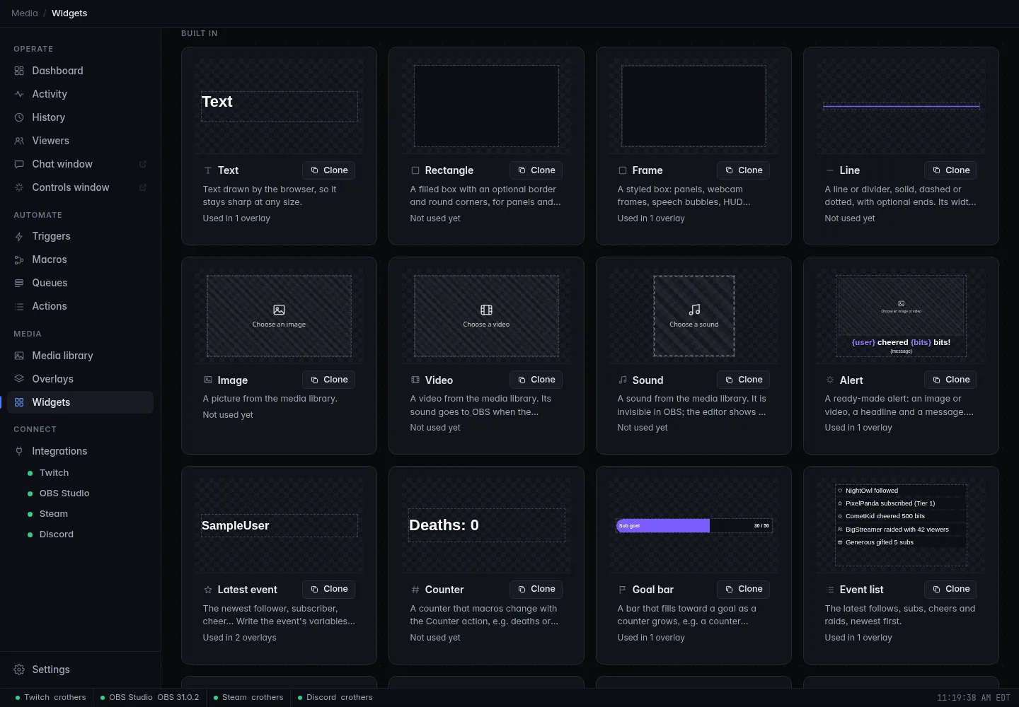
The Widgets library
The page has two lists:
- Your widgets: widgets you made, cloned or imported. Click one to open it in the widget editor. Each card says which overlays use it.
- Built in: the 27 widgets that come with CroStream, with a live preview of each.
Use Search widgets to find one by name, description or tag, and click tags to filter by them.
You don't need this page to use widgets: every widget is in the overlay editor's Add menu. Come here when you want to change how a widget works inside, or share one.
Clone a built-in widget
A built-in widget has settings for the usual changes (fonts, colors, sizes, frames). When you want more, such as a different layout or extra pieces, clone it: you get your own copy whose HTML, CSS and JavaScript you can change.
- Find the widget under Built in and click Clone.
- Give your copy a name and click Clone.
- The widget editor opens. Change it, then click Save.
Your copy appears under Your widgets and in the overlay editor's Add menu under Your widgets. The built-in stays as it was.
Editing a widget's code is covered in Development → Write your own widgets.
Make your own
New widget starts an empty widget and opens the widget editor. The editor has tabs for the HTML, CSS and JS, the Fields (the settings streamers see in the inspector), Data & sample, Settings (name, icon, tags, size) and History (earlier saved versions you can restore), with a live preview beside them. The code tabs are a real code editor: it colours the code, suggests names as you type, underlines mistakes (hover one to see what's wrong and, often, the fix), and tidies messy code with Format. The full guide is Development → Write your own widgets, and its code editor section covers every check and shortcut.
Your widgets are linked
An overlay always draws a widget's latest saved version. When you save a widget, every overlay that uses it updates, live on stream. The editor reminds you: Linked: saving updates every overlay using it. Changes save when you click Save (Ctrl+S), or by themselves after a pause if you turn on Autosave.
Share a widget
Click ⋯ on one of your widgets (or right-click it):
| Menu item | What it does |
|---|---|
| Edit | Opens the widget editor. |
| Duplicate | Makes a copy named "… copy". |
| Export | Saves the widget as a .slwidget file you can send to someone. |
| Delete | Deletes the widget. First it lists the overlays that use it: their elements of this widget are left empty. Export it first if you might want it back. |
To use a widget someone sent you, click Import at the top of the page
and choose the .slwidget file (you can pick several). It's added to Your
widgets and the overlay editor's Add menu.
Only import widgets from people you trust
A widget file holds code. CroStream runs it in a locked-down sandbox with no internet access and no way into the app or your files, but a badly made widget can still look wrong or slow OBS down.
On Linux
The Linux desktop app can't safely run the code of your own widgets, so those elements show a note in the editor instead of their content: Custom widget code doesn't run in the Linux desktop app. They work normally in OBS, and you can preview them in the browser UI (browser mode). Built-in widgets work everywhere.
Built-in widgets
Every widget shares the common settings in the inspector (Name, position, size, Rotation, Opacity, Hidden, Locked, CSS; see The inspector). The tables below list what each widget adds, by the section it's under in the inspector.
Many settings can follow the overlay's theme. Text settings have a full Effects panel, and Frame, Plate, Box and Row frame settings open the frame editor. A "plate" or frame left empty draws nothing.
Placeholders in braces, like {user}, are replaced with real values on
stream. Each widget lists the ones it understands.
| Widget | In short |
|---|---|
| Text | Words, sharp at any size |
| Rectangle | A simple box |
| Frame | A styled box: panels, webcam frames, speech bubbles |
| Line | A line or divider |
| Image | A picture from your media library |
| Video | A video from your media library |
| Sound | A sound, invisible on stream |
| Icon | A platform logo or symbol |
| Alert | A ready-made alert: picture, headline, message, sound |
| Latest event | Your newest follower, subscriber, cheer… |
| Counter | A number your macros change, like deaths |
| Goal bar | A bar that fills toward a goal |
| Event list | Recent follows, subs, cheers and raids |
| Chat box | Your chat on stream |
| Leaderboard | Your top supporters |
| Stream info | Title, category, uptime, viewers |
| Hype train | The running hype train |
| Poll | The current poll or prediction |
| Credits | An end-of-stream roll |
| Timer | Countdown, stopwatch or countdown to a time |
| Clock | The time and date |
| Prize wheel | A wheel your macros spin |
| Particles | Confetti, fireworks, snow, hearts |
| Chat emotes | Chat's emotes raining across the screen |
| Slideshow | The pictures and videos of a folder |
| Ticker | A scrolling line of messages |
| Socials | Your social handles with their icons |
Text
Text drawn by the browser, so it stays sharp at any size.
| Section | Setting | What it does |
|---|---|---|
| Text | The words. Can be several lines. | |
| Font | Font, Size, Weight, Italic, Color | How the letters look. Weight goes from Light to Black. |
| Layout | Align, Vertical | Left, center or right; top, middle or bottom of the box. |
| Layout | Line height, Letter spacing | Spacing between lines and letters. |
| Layout | Case | As typed, UPPERCASE or lowercase. |
| Effects | Effects | Fills, outlines, shadows, glow, animation. See Text effects. |
To change the words from a macro, use Set overlay text.
Rectangle
A filled box with an optional border and round corners: Fill, border Width and Color, and Corner radius. For anything fancier, use a Frame.
Frame
A styled box for panels, webcam frames, speech bubbles, HUD corners or your own frame image. It has one setting, Frame, which opens the full frame editor with its presets.
Line
A line or divider. Its width is the line's length; rotate the element for other angles.
| Section | Setting | What it does |
|---|---|---|
| Line | Thickness, Style | Solid, Dashed or Dotted. |
| Line | Dash length, Gap | For dashed and dotted lines. |
| Line | Color, Gradient to | One color, or add a second for a gradient. |
| Ends | Start, End, End size | None, Round, Square, Arrow, Dot or Diamond. |
| Glow & motion | Glow, Glow color | A soft light around the line. |
| Glow & motion | Animation, Cycle | None, Flow (dashes or light travel along it) or Pulse (the glow breathes), and how long one cycle takes. |
Image
A picture from your media library: Image, Fit (Fit inside, Fill and crop or Stretch) and Corner radius. Animated GIFs play.
Video
A video from your media library.
| Section | Setting | What it does |
|---|---|---|
| Video, Fit, Corner radius | Which file and how it fills the box. | |
| Playback | Play when shown | Starts playing when the element appears. |
| Playback | Loop, Mute, Volume |
Its sound goes to OBS when the browser source has Control audio via OBS on. To restart it from a macro, use Play media or fire an effect.
Sound
A sound from your media library: Sound, Play when shown, Loop, Volume. It's invisible in OBS (the editor shows a marker). Use it in a group with other elements to play a sound when the group shows, or play it from a macro with Play media or fire an effect.
Icon
A single icon: a platform logo (Twitch, YouTube, Kick, Discord, X, TikTok, Instagram, Facebook, Threads, Bluesky, GitHub, Patreon, Ko-fi, PayPal, Spotify, Steam, Xbox, PlayStation, Nintendo, Website) or a symbol (heart, star, bolt, crown, trophy, gift, music, microphone, camera, gamepad, chat, fire).
Settings: Icon, Color (leave it empty to use the brand's own color for logos), Glow and Glow color, and a Plate behind it, for example a circle.
Alert
A ready-made alert: a picture or video, a headline, a message and a sound. Keep it Hidden in the design; the Show an alert action brings it up. The easiest way to make one is the alert wizard.
| Section | Setting | What it does |
|---|---|---|
| Layout | Image above text, Image left of text, Image right of text, Text only, Image only. | |
| Image or video | The picture, GIF or video. | |
| Text | Headline | For example {user} cheered {bits} bits! |
| Text | Message | Shown under the headline when the event has one, usually {message}. |
| Text | Align, Gap | Text alignment and the space between the parts. |
| Headline | Font, Size, Weight, Color, Effects | |
| Headline | Variables | A highlight color for the filled-in placeholders, so {user} stands out. |
| Message | Font, Size, Color, Effects | |
| Box | Frame | A box behind the alert's content. |
| Sound, Volume | A sound from your media library. |
Placeholders are the ones of the event that shows the alert. See Alerts.
Latest event
The newest follower, subscriber, cheer and so on, for example "Latest follower: haliebug13".
| Section | Setting | What it does |
|---|---|---|
| Event | Follower, Subscriber, Gift subs, Cheer, Raid or Redemption. | |
| Text | For example {user} or {user} · {bits} bits. Uses that event's placeholders. |
|
| Until the first one | Shown before any such event has happened. | |
| Font | Font, Size, Weight, Color, Align | |
| Effects | Effects | |
| Plate | Plate | A box behind the text. |
Counter
A number that your macros change with the Change a counter action, such as deaths, wins or hugs.
| Section | Setting | What it does |
|---|---|---|
| Counter | The counter's name, as in the Change a counter action, for example deaths. |
|
| Text | {count} is the value, for example Deaths: {count}. |
|
| Font | Font, Size, Weight, Color, Align | |
| Effects | Effects | |
| Plate | Plate | A box behind the text. |
Goal bar
A bar that fills toward a goal as a counter grows. For a sub goal, make a macro that adds 1 to a counter on every sub, and point the goal bar at that counter.
| Section | Setting | What it does |
|---|---|---|
| Counter | The counter's name, as in the Change a counter action. | |
| Goal | The target number. | |
| Text | Title | For example Sub goal. |
| Text | Progress | {count} and {goal}, for example {count} / {goal}. |
| Text | Font, Size, Color, Effects | |
| Bar | Track, Fill | Frames for the empty bar and the filled part. |
Event list
The latest follows, subs, cheers and raids, newest first.
| Section | Setting | What it does |
|---|---|---|
| Show | Follows, Subscriptions, Gift subs, Cheers, Raids, Redemptions | Which events to list. |
| Layout | How many (1 to 20), Direction (Downward or Across), Gap | |
| Look | Font, Size, Color | |
| Effects | Effects | |
| Box | Frame | A box behind the whole list. |
| Rows | Row frame | A box behind each event. |
Chat box
Your Twitch chat on stream.
| Section | Setting | What it does |
|---|---|---|
| Messages | How many to show (1 to 50). | |
| Fade after | Seconds before a message fades away; 0 keeps them. | |
| Newest on top | Flips the order. | |
| Look | Font, Size, Names (color), Messages (color) | |
| Effects | Effects | Still effects only; chat lines don't animate. |
| Box | Frame | A box behind the whole chat. |
| Messages | Message frame | A box behind each message. |
Leaderboard
Your top supporters.
| Section | Setting | What it does |
|---|---|---|
| Ranked by | Bits cheered, Subs gifted, Chat messages, Points or Watch time (minutes). | |
| Period | This stream, This week or All time. | |
| How many | 1 to 10. | |
| Text | Title | Above the list, for example Top cheerers. Empty for none. |
| Text | Show the numbers | Shows each person's value. |
| Text | Row | {rank}, {user} and {value}, for example {rank}. {user} · {value}. |
| Text | Font, Size, Weight, Color, Medal colors | Medal colors tint the top three gold, silver and bronze. |
| Effects / Box / Rows | Effects, Frame, Row frame |
Points and watch time come from your viewer database.
Stream info
Your stream's title, category, uptime and viewer count, from Twitch.
| Section | Setting | What it does |
|---|---|---|
| Text | Text | Any of {title}, {category}, {uptime}, {viewers} and {live}, for example {category} · {uptime} · {viewers} viewers. |
| Text | While offline | Shown instead when you're offline. Empty keeps the text. |
| Text | Font, Size, Weight, Color, Align | |
| Effects / Box | Effects, Plate |
Hype train
The running Twitch hype train: its level and progress toward the next.
| Section | Setting | What it does |
|---|---|---|
| Text | Title | For example Hype Train. |
| Text | Level | {level}, for example Level {level}. |
| Text | Progress | {progress}, {goal} and {percent}. |
| Behavior | Hide when idle | Only shows while a hype train runs. On by default. |
| Text | Font, Size, Weight, Color | |
| Effects / Box / Bar | Effects, Frame, Track, Fill |
Poll
The current Twitch poll or prediction, with a live bar for each choice.
| Section | Setting | What it does |
|---|---|---|
| Shows | The poll, or The prediction. | |
| Behavior | Hide when idle | Only shows while there's a poll or prediction. |
| Behavior | Votes, Percentages | Vote counts (or channel points for predictions), and percentages. |
| Text | Font, Size, Weight, Color | |
| Effects / Box / Choices | Effects, Frame, Choice frame, Bar |
Credits
An end-of-stream roll of this stream's followers, subscribers, gifters, cheerers, raiders and chatters, like film credits. Put it on your "Ending" scene.
| Section | Setting | What it does |
|---|---|---|
| Text | Title | For example Thanks for watching! |
| Show | Followers, Subscribers, Gifters, Cheerers, Raiders, Chatters | Which lists to roll. |
| Roll | Speed, Loop, Columns (1 to 3) | |
| Headings | Font, Size, Color | |
| Names | Font, Size, Color | |
| Effects / Box | Effects, Frame |
Timer
A countdown, a stopwatch, or a countdown to a time of day.
| Section | Setting | What it does |
|---|---|---|
| Timer name | Macros control the timer by this name. Elements that share a name show the same time. | |
| Mode | Count down, Stopwatch or Count down to a time. | |
| Behavior | Count down to | For "to a time": 20:30 (today, or tomorrow if that's past) or a date and time like 2026-10-09T20:30. |
| Behavior | Start from | Where a countdown starts, in seconds. |
| Text | Format | Automatic, 01:02:03, 62:03 or 4 min 12 s. |
| Text | Text | Must contain {time}, for example Starting in {time}. |
| Text | When it reaches zero | Shown instead of 0:00, for example Starting now! |
| Text | Font, Size, Weight, Color, Align | |
| Effects / Box | Effects, Plate |
A countdown or stopwatch runs when a macro starts it with Control a
timer (start, pause, resume, reset, set, add, subtract). For a subathon,
add time on every sub or cheer and set Longest countdown as a cap. A
countdown to a time runs by itself. Until Count down to holds a time
it can read, it shows --:--, and on the overlay editor's canvas a note
says Set a target time (the note never shows on stream).
From 24 hours on, every format shows the days first: 3d 04:12:09, or
3 d 4 h 12 min 9 s in words.
Clock
The time and/or date on your PC.
| Section | Setting | What it does |
|---|---|---|
| Show | Time, Date, or Date and time. | |
| Format | Hours | Automatic, 12-hour or 24-hour. |
| Format | Seconds | Shows seconds. |
| Format | Date | Short (10/9/26) to full (Friday, October 9, 2026). |
| Format | Time zone | Empty for your PC's; otherwise a name like Europe/London. |
| Text | Text | Must contain {time}, for example Local time {time}. |
| Text | Font, Size, Weight, Color, Align | |
| Effects / Box | Effects, Plate |
Prize wheel
A wheel of prizes. The Spin the wheel action picks a slice and every
overlay showing the wheel spins to it. The bigger a slice's weight, the
likelier it wins. Later steps in the macro can use {result}.
| Section | Setting | What it does |
|---|---|---|
| Slices | 2 to 24, each with a Label, Color and Weight (its chance compared to the others). | |
| Spin | Spin takes, Pointer | How long a spin lasts; where the pointer sits (top, right, bottom, left). |
| Text | Font, Size, Color | Text on the slices. |
| Rim | Width, Color | |
| Center | Center | Written on the hub, for example SPIN. |
| Result | Show the result, Result text | {result} is the winning slice. |
| Effects / Box | Effects, Plate |
Particles
Confetti, sparkles, fireworks, snow, hearts or emoji. Make it as big as the whole canvas.
| Section | Setting | What it does |
|---|---|---|
| Kind | Confetti, Sparkles, Fireworks, Snow, Hearts or Emoji. | |
| Mode | Burst when played (fired by the Play media or fire an effect action) or Always running. | |
| Look | Emoji | For the Emoji kind: the characters to throw, for example 🎉✨. |
| Look | Colors | Up to 8. Empty uses the theme's colors. |
| Look | Size | |
| Motion | Amount, Speed, Gravity | |
| Burst | Spread, Starts from, Lasts | Where a burst comes from (center, an edge, or anywhere) and how long it lasts. |
Chat emotes
The emotes people use in chat rain, float, bounce or burst across this element. Size it over the whole canvas or part of it.
Settings: Motion (Rain down, Float up, Bounce around, Burst out), Size, Unicode emoji (also throw emoji people type), Most at once, Stays for and Speed.
Slideshow
The pictures and videos of one media library folder, one after another. Pictures show for the interval; videos play to their end. Sounds in the folder are skipped.
| Section | Setting | What it does |
|---|---|---|
| Folder | A folder of your media library. Only files directly in it are shown, not those in its subfolders. | |
| Playback | Seconds per picture | |
| Playback | Change with | Cut, Fade, Slide or Zoom. |
| Playback | Fit | Fit inside, Fill and crop or Stretch. |
| Playback | Shuffle, Mute videos | |
| Box | Frame | A frame around the slides. |
Ticker
A scrolling line of your own messages and, if you like, your latest follows, subs and cheers.
| Section | Setting | What it does |
|---|---|---|
| Messages | Messages | Up to 50 lines that scroll by in turn. |
| Events | Recent events | Also scroll the latest events, then pick Follows, Subscriptions, Gift subs, Cheers, Raids. |
| Motion | Separator | Between entries, for example •. |
| Motion | Speed, Direction | Pixels per second; right to left or left to right. |
| Text | Font, Size, Weight, Color | |
| Effects / Box | Effects, Bar |
Socials
Your social handles with their icons, one at a time or all at once.
| Section | Setting | What it does |
|---|---|---|
| Accounts | Up to 12, each a Platform and a Handle. | |
| Layout | Layout | One at a time, In a row or In a column. |
| Layout | Seconds each, Change with | For one at a time: how long each shows; Fade, Slide or Flip. |
| Layout | Gap | |
| Icons | Brand colors, Icon color | |
| Text | Font, Size, Weight, Color | |
| Effects / Box / Accounts | Effects, Frame, Account frame |
Related
- Overlays: placing, arranging and styling elements
- Alerts: the alert wizard and the alert queue
- Media library
- Development → Write your own widgets
- Development → Overlay data: the live data widgets read