Custom CSS
Every element on an overlay can carry your own CSS, and so can the overlay as a whole. Use it when the inspector's settings (colors, fonts, text effects, frames) don't go far enough: glass panels behind chat rows, a neon first place on a leaderboard, an animation on an alert's headline. This page explains where CSS applies and how it's scoped, lists the named parts of every built-in element, and ends with a worked example.
Where CSS goes
| Where | Set it in | Styles |
|---|---|---|
| Element CSS | The overlay editor's inspector, CSS section, with an element (or group) selected | That element only |
| Overlay CSS | The same section with nothing selected, where it's called Overlay CSS | Everything on the overlay |
| Widget CSS | The CSS tab of the widget editor | The inside of one custom widget, on every overlay that uses it |
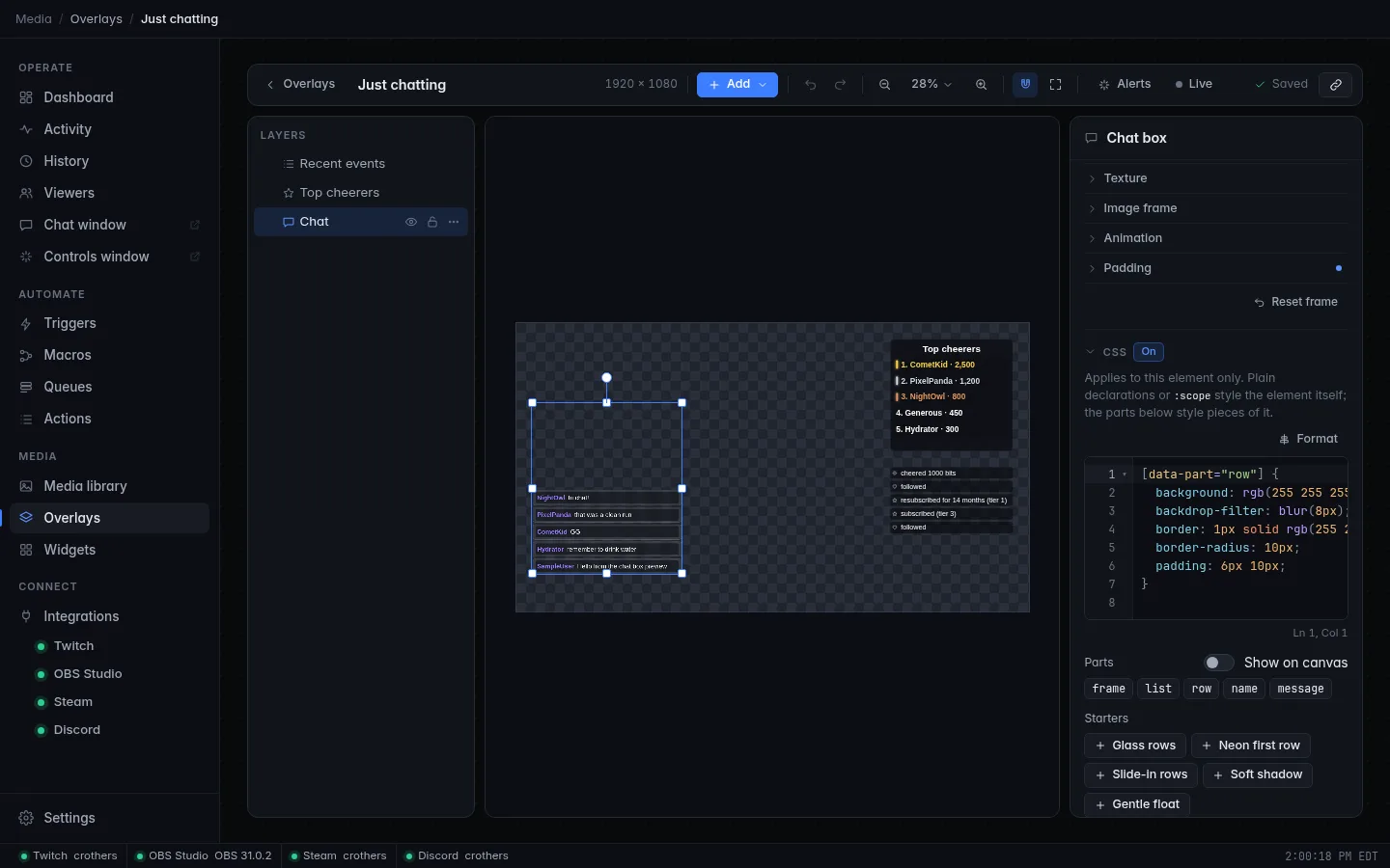
The CSS section lists the element's Parts: click one to insert its selector, and switch on Show on canvas to outline the parts in the editor (hover one to see its name). Starters insert ready-made snippets you can adjust: Glass rows, Neon first row, Slide-in rows, Striped bar, Gradient text, Soft shadow and Gentle float, depending on the element; Shadow on everything and Fade in on load for the overlay.
CSS is saved as you type (one undo step per pause), and reaches OBS immediately, with no refresh. CSS that breaks the rules below is refused with a message, so a typo can't break the overlay.
The CSS box
The box is the same code editor as the widget editor's tabs: coloured CSS, line numbers, folding, find and replace (Ctrl+F), several cursors and comment toggling (Ctrl+/). It grows with your CSS up to 16 lines, then scrolls.
It checks the CSS as you type, about a third of a second after you stop:
- Syntax errors are underlined in red: a missing
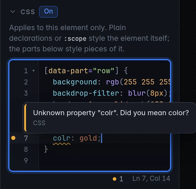
;or}reads "CSS syntax error near …" or "The CSS ends early: a "}" or ";" may be missing". Bare declarations (opacity: 0.9;with no selector) are fine here; they style the element itself. - Unknown properties are underlined in amber, with a suggestion when
one is close:
colr: goldreads "Unknown property "colr". Did you mean color?". Custom properties (--sl-gap) and vendor-prefixed ones (-webkit-text-stroke) are never flagged. The list of known properties comes from the web view CroStream runs in, so a very new property may be flagged although OBS supports it; the CSS still applies.
Hover an underline to read its message, or hover the dot next to the line number. The counter under the box (red for errors, amber for warnings) opens the list of all problems; so does Ctrl+Shift+M (Cmd+Shift+M on macOS). These checks are advice: CSS with a warning is saved and applied. The rules in What's allowed are different: CroStream refuses CSS that breaks them, and shows why in red under the box.
Completion: typing a property suggests property names, and after the
colon their keywords. Inside var( (or after typing --) it suggests the
custom-widget variables --sl-w, --sl-h, the theme colors
(--sl-primary …) and fonts (--sl-font-heading, --sl-font-body).
Those only have values inside a custom widget's frame, which element CSS
on a custom widget also reaches (see On a custom widget);
the variables built-in elements read, such as --sl-gap, are in
CSS variables below and aren't suggested. Hovering a
--sl-… variable shows what it holds.
Format: click Format above the box (greyed out while it's empty), or press Shift+Alt+F (Shift+Option+F on macOS) in it, to tidy the CSS with Prettier: one declaration per line, two-space indentation. Ctrl+Z (Cmd+Z) undoes it. CSS with a syntax error isn't formatted; the reason shows under the box.
The box takes up to 64 KB and stops accepting text at that size.
How element CSS is scoped
You write ordinary CSS; CroStream rewrites it so it can only reach its own element:
- Every selector is prefixed with the element, so
[data-part="row"] { … }matches rows of this element only, never another chat box. -
The element itself is styled by bare declarations, or by a rule that starts with
:scope,&,html,bodyor:root. These three are the same: -
It wins over the element's own styles without
!important: element CSS outranks the overlay CSS, and both outrank the built-in styles. - Except inline styles. A style an element sets from its own settings
(a color, a gap, a radius you chose in the inspector) is inline, and
inline styles win. Override those with the element's
CSS variables, or with
!important. - Nesting works (
[data-part="row"] { &:first-child { … } }). @keyframesnames are private to the element: two elements can both define@keyframes pulsewithout clashing. Use the name as written; the rewrite updatesanimationandanimation-nameto match.- At-rules:
@media,@supports,@container,@layer,@starting-style,@font-faceand@keyframesare kept.@import,@charset,@namespace,@property,@scope,@pageand unknown at-rules are dropped.
Overlay CSS works the same way, scoped to the overlay's canvas: bare
declarations and :scope style the canvas, and [data-node-id] matches
every element on it:
/* A soft shadow under everything on this overlay. */
[data-node-id] {
  filter: drop-shadow(0 4px 10px rgb(0 0 0 / 0.5));
}
On a custom widget
A custom widget draws inside its own sandboxed frame, so element CSS applies to it twice:
- Outside the frame, scoped to the element's box like any element: this moves, fades, rotates or filters the whole widget.
- Inside the frame, as a plain stylesheet after the widget's own CSS:
this can restyle the widget's classes for this one element
(
.title { color: gold; }).
The hint under the CSS box of a custom widget says the same: "This CSS also applies inside the custom widget's frame, after the widget's own CSS, so it can restyle the widget's HTML too."
A rule such as :scope { filter: … } therefore applies once outside and
once to the frame's page; keep effects like shadows to one place, or
scope the inside rules to the widget's own classes. To change a widget
everywhere, edit its CSS in the widget editor instead.
What's allowed
CSS must not load code or reach the network. These are refused when you type them (the box shows the error) or dropped:
@importurl()to anything but a media library path (/media/…) or adata:URIimage-set(),src(),expression(),behavior:and-moz-binding- backslash escapes outside strings (they can spell any of the above)
</styleand<!--, which could end the stylesheet
A stylesheet can be up to 64 KB. Library images work as backgrounds, by
their file URL: /media/file/<item id>. The media library doesn't show
item IDs; look one up with the HTTP API (LibraryList with a
search), or place the picture with an Image element instead.
Widget CSS (the widget editor's CSS tab) has none of these checks, because the widget's frame blocks the network anyway. See the sandbox.
Parts of each element
Each built-in element marks its pieces with data-part. Select them with
[data-part="name"].
| Element | Parts |
|---|---|
| Text | text |
| Rectangle | rect |
| Frame | frame |
| Line | line (an SVG) |
| Image | media |
| Video | media (the poster in thumbnails) |
| Alert | box (the frame), media (picture or video), words (headline and message together), headline, message |
| Latest | plate (the frame behind the text), text |
| Counter | plate, text |
| Goal | track (the bar's background), bar (the filled bar), title, progress (e.g. 120 / 500) |
| Recent events | frame, list, row (one event), icon, text |
| Chat | frame, list, row (one line), name, message |
| Timer | plate, text, time (the box around the digits) |
| Clock | plate, text |
| Ticker | frame, track (the scrolling strip), item, separator |
| Stream info | plate, text |
| Leaderboard | frame, title, list, row (one supporter), medal (the gold, silver or bronze dot), rank, user, value |
| Icon | plate, icon |
| Socials | frame, list, item (one handle), icon, handle |
| Credits | frame, roll (the scrolling roll), title, section, heading, name |
| Wheel | frame, wheel, slice (an SVG path), label, pointer (an SVG path), hub-disc (an SVG circle), hub (the center text), result |
| Particles | canvas |
| Hype train | frame, title, level, timer (time left), track, bar, progress |
| Poll | frame, title (the question), status, list, row (one choice), label, bar, votes, percent |
| Chat emotes | emote (one flying emote) |
| Slideshow | frame, slide (the current picture or video) |
| Audio | (none) |
Rows carry extra attributes you can select on:
- Leaderboard rows:
[data-part="row"][data-rank="1"](the rank, from 1). - Recent events rows:
[data-part="row"][data-type="twitch.cheer"], by event type (twitch.follow,twitch.sub,twitch.gift,twitch.raid,twitch.redemption, …).
/* Gold first place, and a pink edge on cheers in the event list. */
[data-part="row"][data-rank="1"] [data-part="user"] {
  color: #ffd84d;
  text-shadow: 0 0 10px rgb(255 216 77 / 0.6);
}
[data-part="row"][data-type="twitch.cheer"] {
  border-left: 4px solid #ff5cf0;
}
Parts drawn by the text renderer
Text parts such as headline and message are drawn by the same
renderer as <sl-text>: plain color, font, letter-spacing and
background-clip: text gradients work on them, while the inspector's
Text effects (outlines, glow, gradients) are usually the easier
way to get those looks.
CSS variables
Some elements read these variables, which override the matching inspector setting even though it's applied inline. Set them on the element:
| Variable | Elements | Overrides |
|---|---|---|
--sl-gap |
Alert, Recent events, Socials, Chat | Space between pieces, rows or handles |
--sl-gap-text |
Alert | Space between headline and message |
--sl-color |
Recent events, Goal | Text color |
--sl-fill |
Rectangle | Fill |
--sl-border-color |
Rectangle | Border color |
--sl-radius |
Rectangle, Image, Video | Corner radius |
Inside a custom widget, a different set of variables describes the
element and the overlay theme: --sl-w, --sl-h, --sl-primary and the
other theme colors, --sl-font-heading and --sl-font-body. See
Environment.
Example: a neon alert
This restyles an alert with a rounded neon border, gradient headline text and a gentle float. The same steps work for any element.
- Open your overlay in Media → Overlays. If you don't have an alert yet, see Alerts.
- Select the alert on the canvas or in the layers list. Alerts are hidden in the design, so it's drawn faded, but you can still select it.
- In the inspector, open the CSS section and switch on Show on canvas to see the parts.
-
Click
boxunder Parts and fill in the rule: -
Click the Gradient text starter (it targets
headline) and change the colors if you like: -
Click Gentle float, and widen the gap between headline and message with the alert's variable:
-
Click Alerts in the toolbar, then Test next to the alert's trigger. The alert plays on stream with sample values, restyled. Change a value and test again; edits reach OBS at once.
Troubleshooting
| Symptom | Fix |
|---|---|
| The box says the CSS isn't allowed | Check it against What's allowed. A url() must start with /media/; remove backslash escapes. |
| A property is underlined in amber | Hover it: it's probably misspelt, and the message suggests the right name. If the name is right, the property is only newer than CroStream's web view, and the CSS is applied anyway: check the result in OBS. |
| A rule has no effect | The setting is probably inline. Use the element's variable, or add !important. |
| A rule styles nothing | Check the part name: switch on Show on canvas and hover the piece. Parts only exist on built-in elements; inside a custom widget, use the widget's own classes. |
| An animation doesn't run | Make sure the @keyframes is in the same box as the rule that uses it. |
| A custom widget's shadow looks doubled | Element CSS applies outside and inside a custom widget's frame; see On a custom widget. |
Related
- Overlays: the editor, themes, text effects and frames.
- Write your own widgets: when CSS isn't enough.
- Overlay data reference: event types for
[data-type].